ASHM Design System
A modular, token-driven design system bridging the gap between Figma and code, powering over 25 uniquely branded websites.
Role
UX Engineer
Scope
25+ Websites
Stack
The System in Action
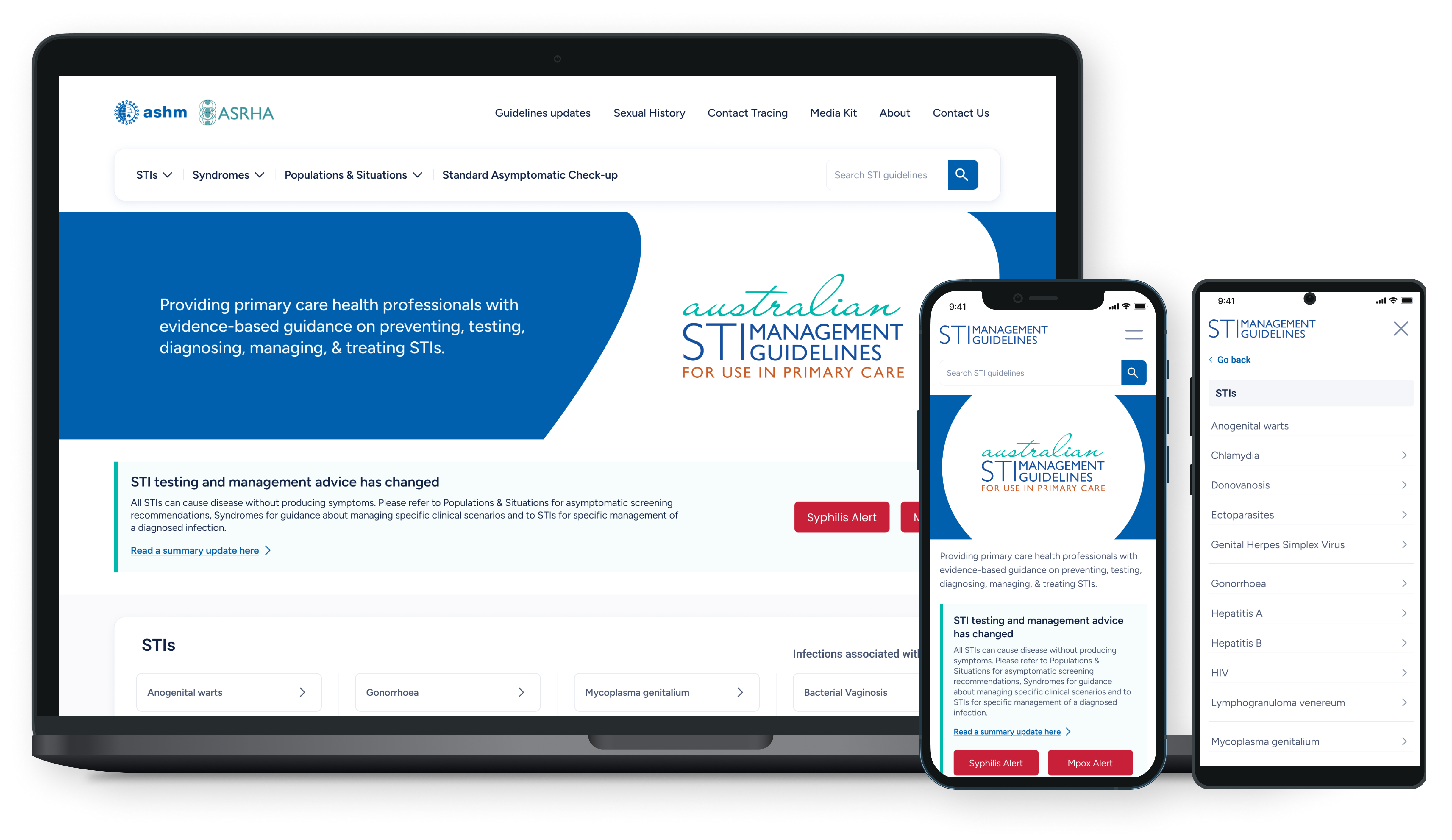
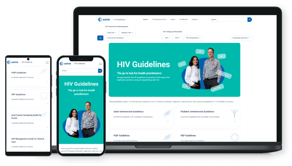
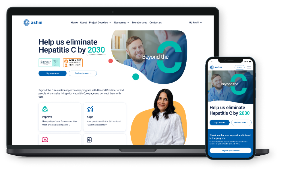
Before diving into the architecture, it is important to see where the journey leads. The ultimate test of any design system is how it scales in production. This foundation successfully powers the core ASHM Health platform, specialized tools like the HIV Guidelines, and independent initiatives like Beyond the C, all pulling from the same central truth.

Why I created the design system
The core challenge was managing expectations across heavily fragmented brandings. Stakeholders from different departments and partner organizations pushed for their unique visual identities across 25 distinct websites.
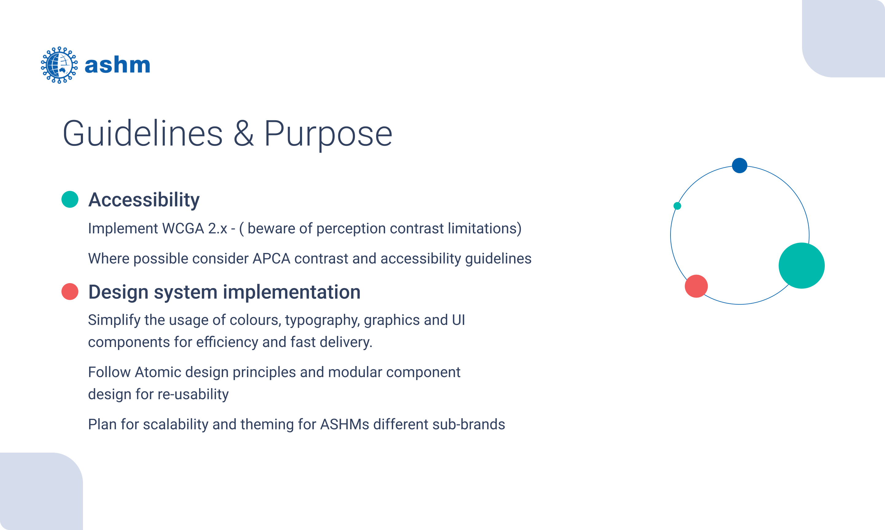
From day one, I knew this would be a permanent work in progress. I needed to find the right methodology to kick off the project, build solid foundations, and establish a direct pipeline between our Figma files and the development repository using Design Tokens.
A unified yet flexible colour system
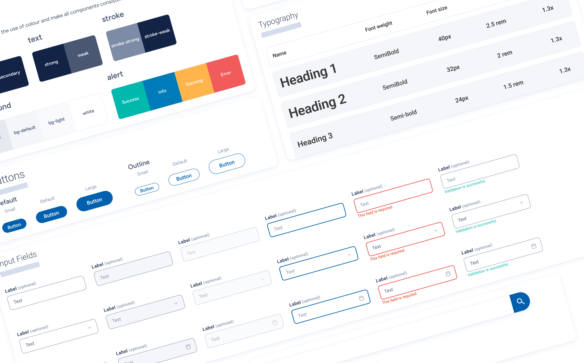
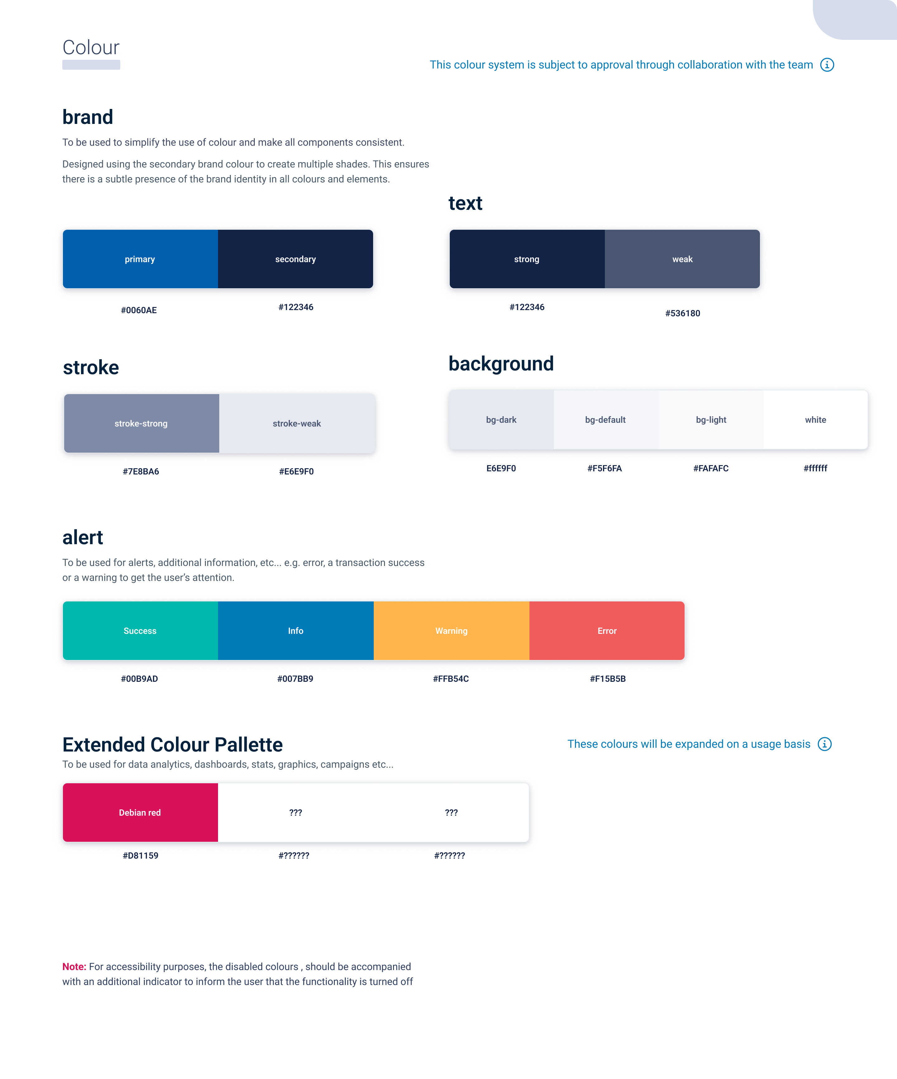
Colour systems have a tendency to become overly complex. I designed this palette to be intuitive yet flexible enough to support the strict WCAG 2.1 level AA accessibility requirements needed for clinical and public health platforms. Early on, I focused my efforts by putting accessibility as a core pillar of the entire system.
Typography and Structure
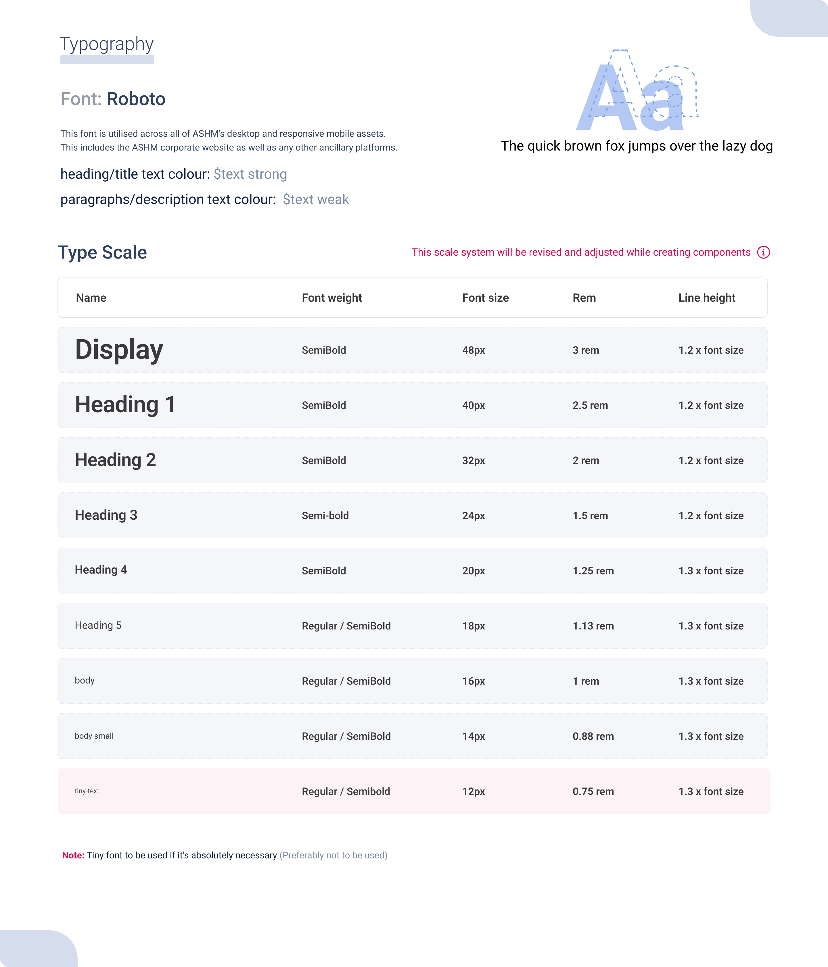
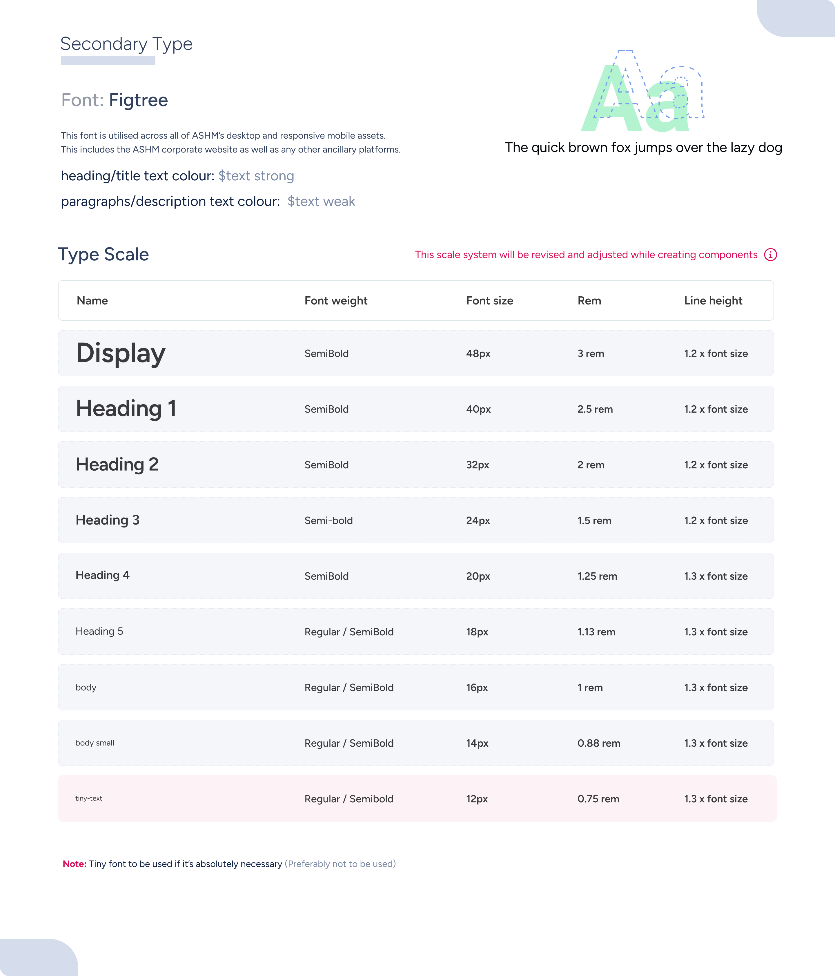
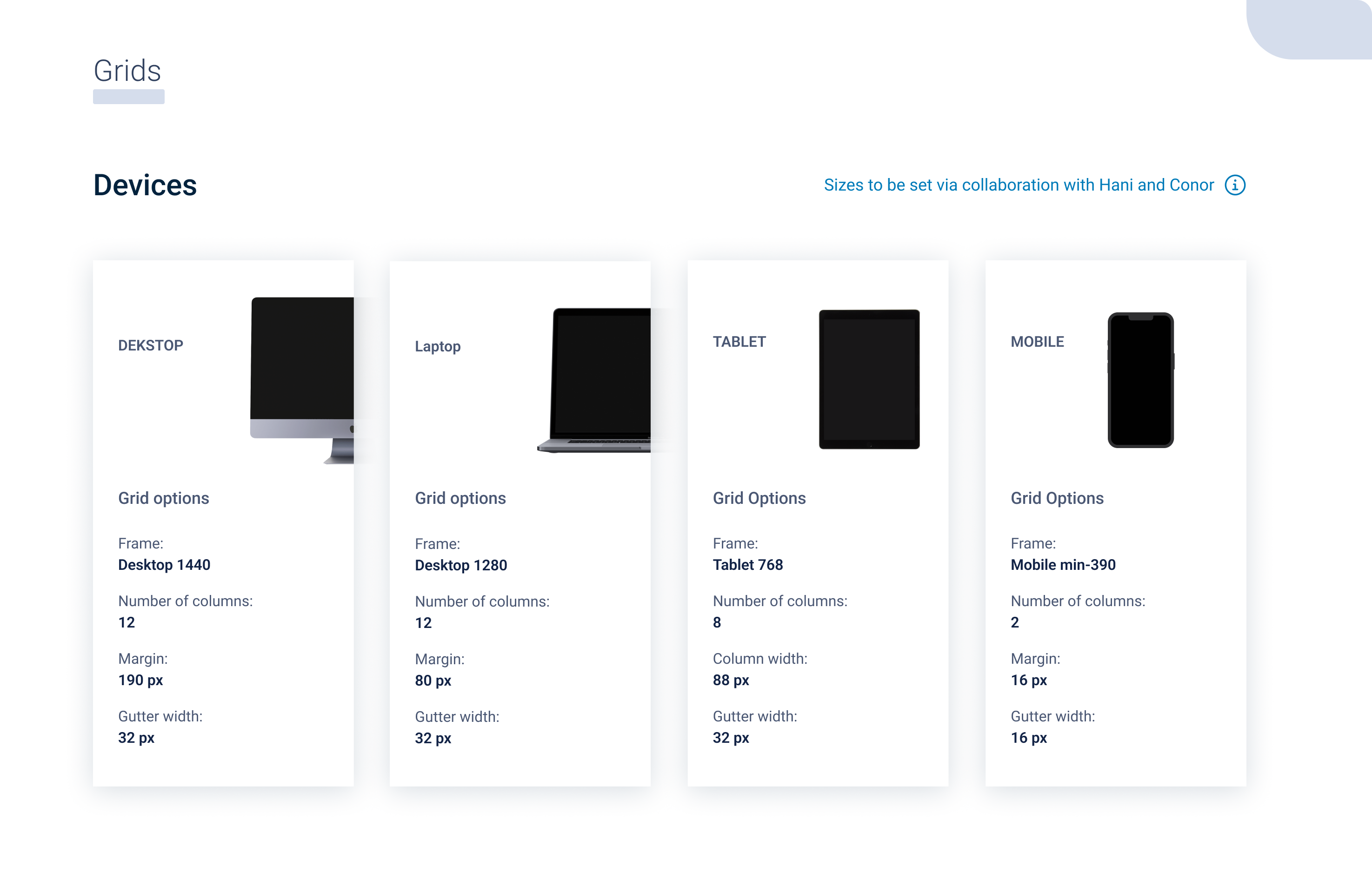
The foundation of any good system is readability. The typography scale is mathematically derived to maintain hierarchy, while the responsive grid system ensures components scale elegantly from mobile devices to ultrawide clinical dashboards. Every decision here was made to save time and be more efficient as a UX Engineer while directly benefiting the developers.
Depth and Elevation
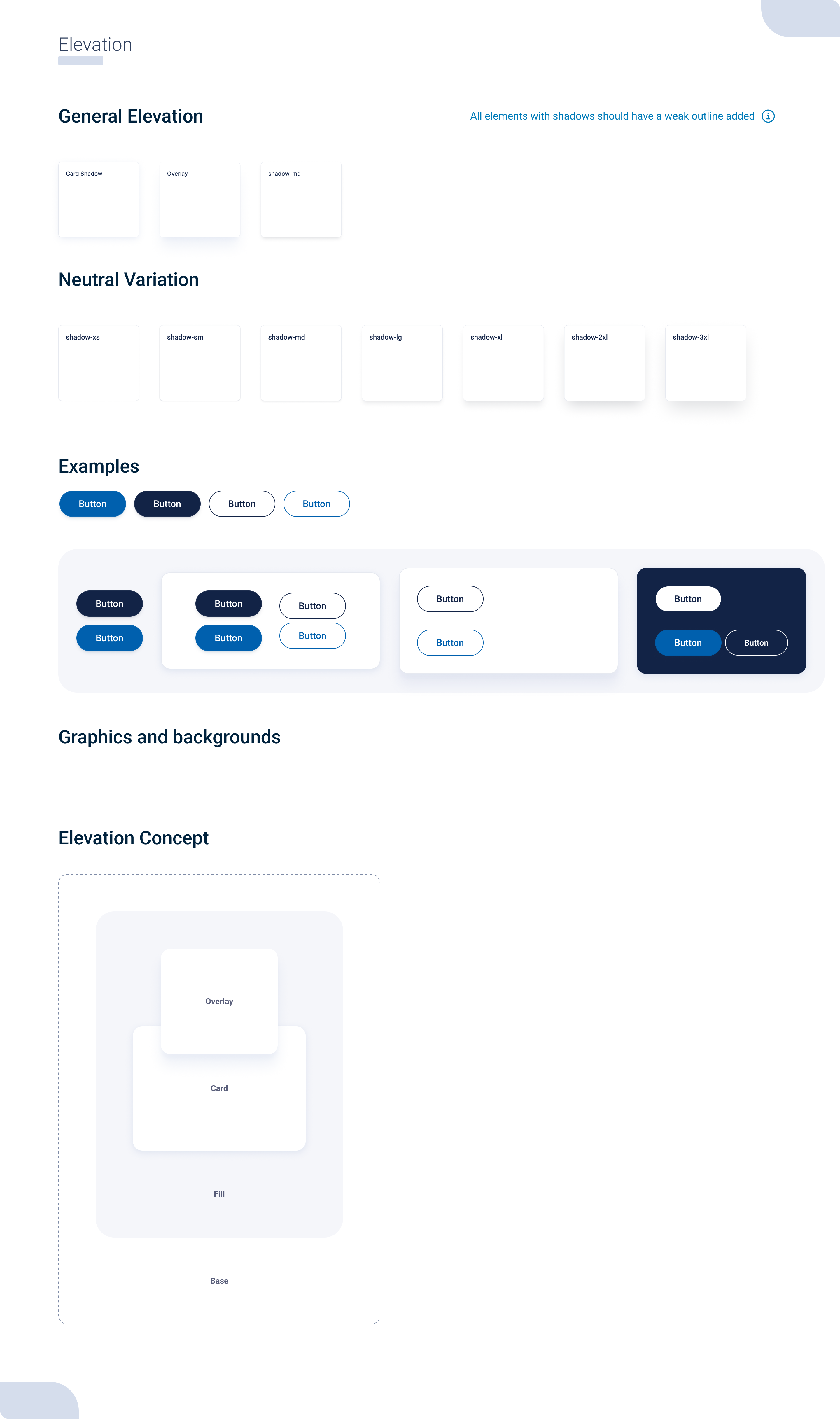
Elevation helps users parse complex interfaces by establishing a clear vertical axis. The shadow system is standardized into distinct tokens, ensuring popovers, modals, and dropdowns always feel spatially accurate. I put great effort into working hand in hand with the developers to ensure these spatial tokens translated perfectly into code.
Intuitive Components
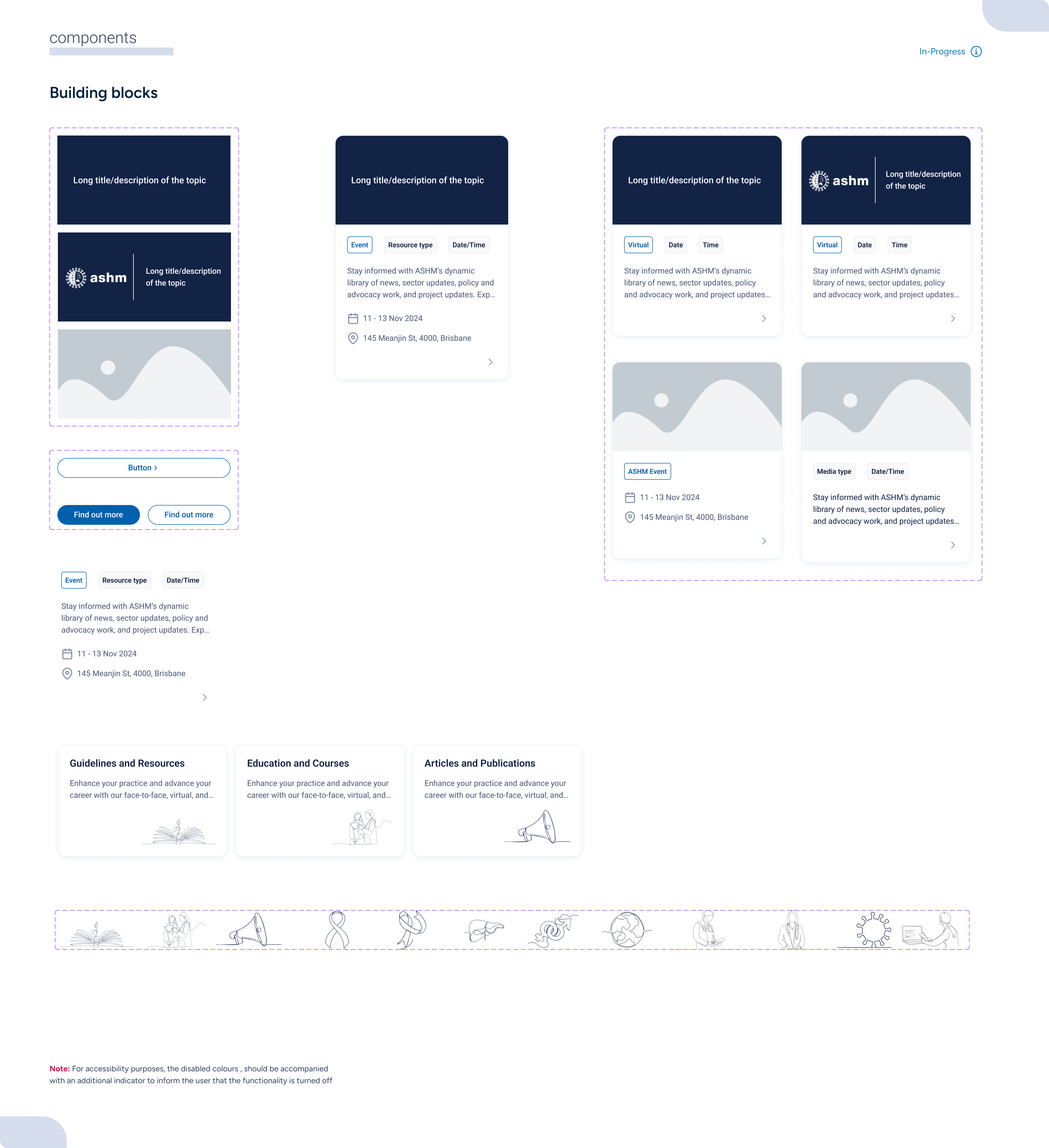
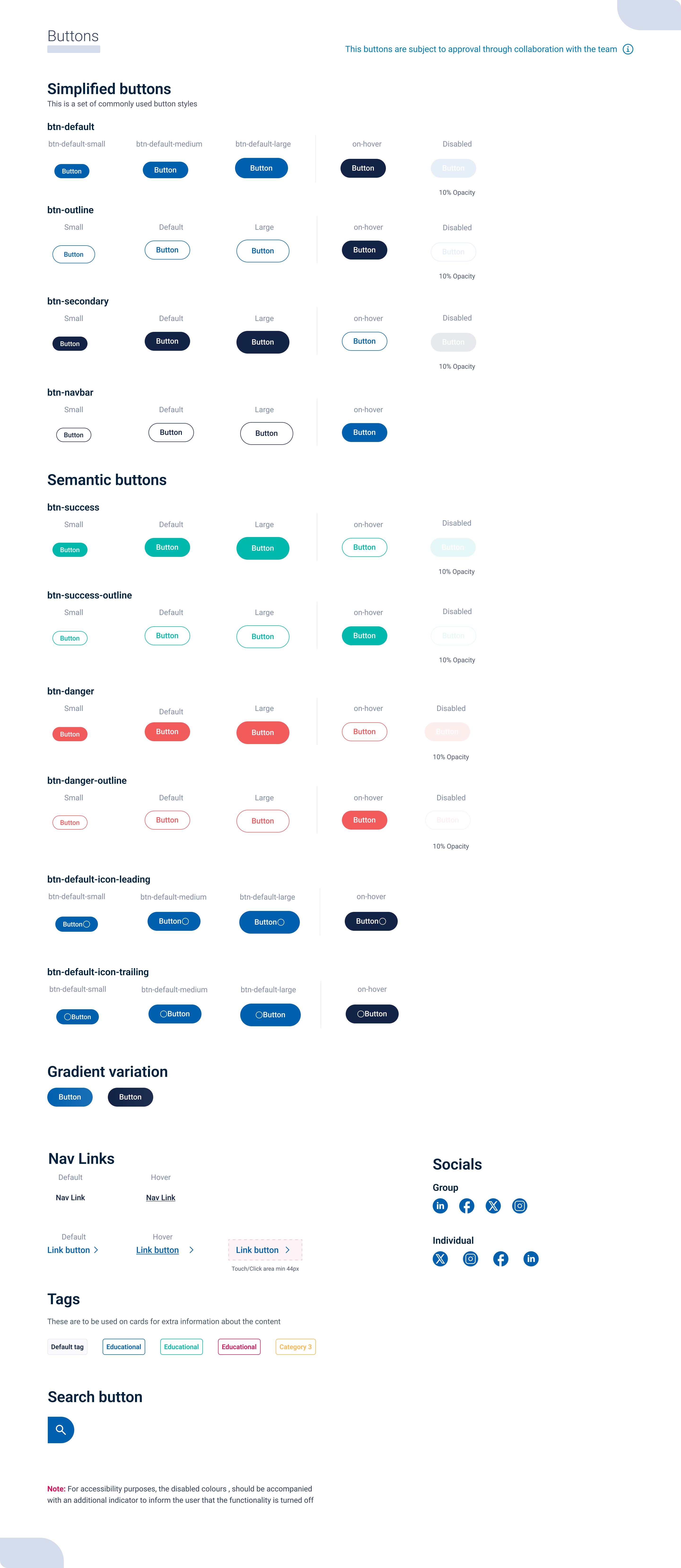
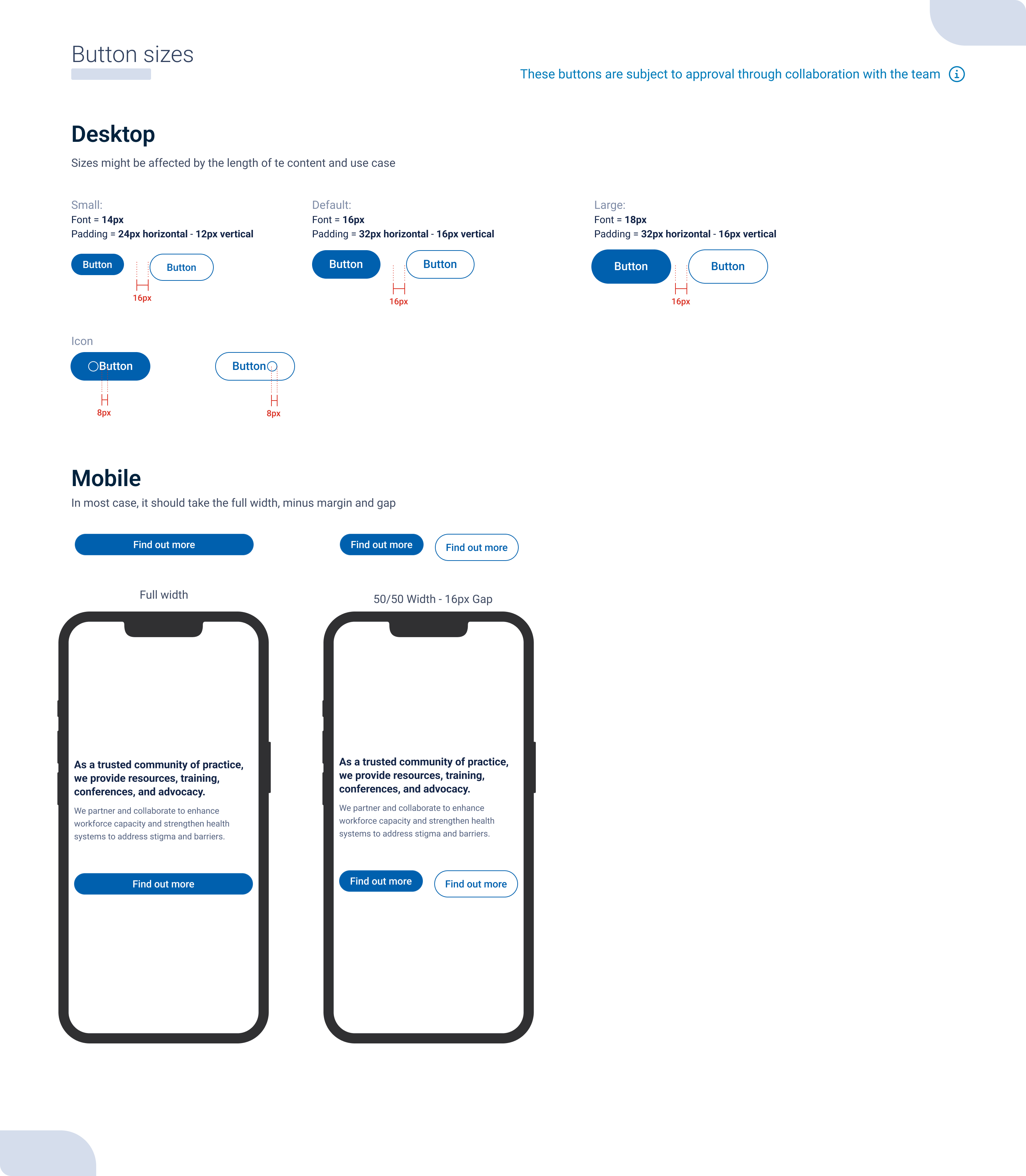
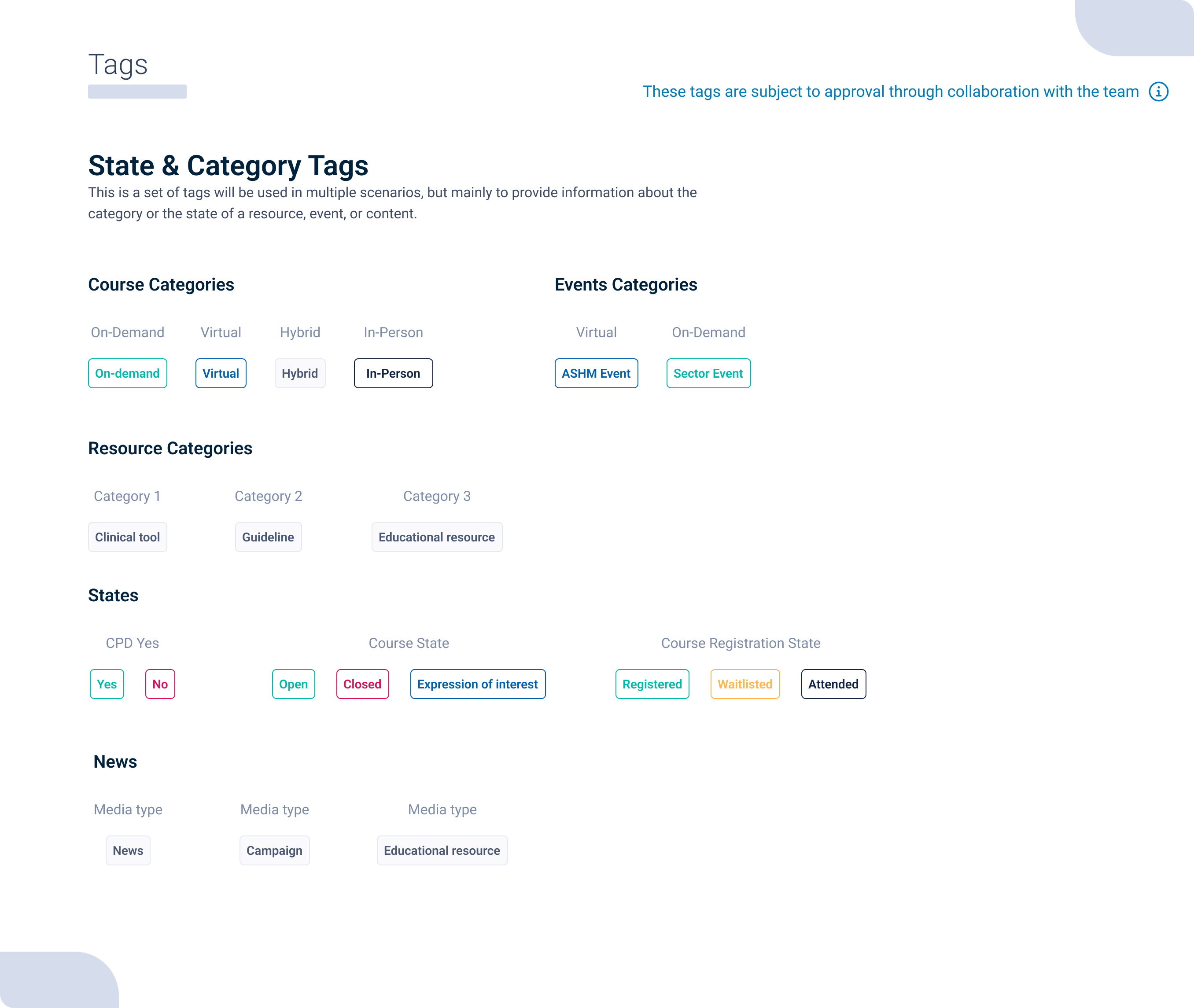
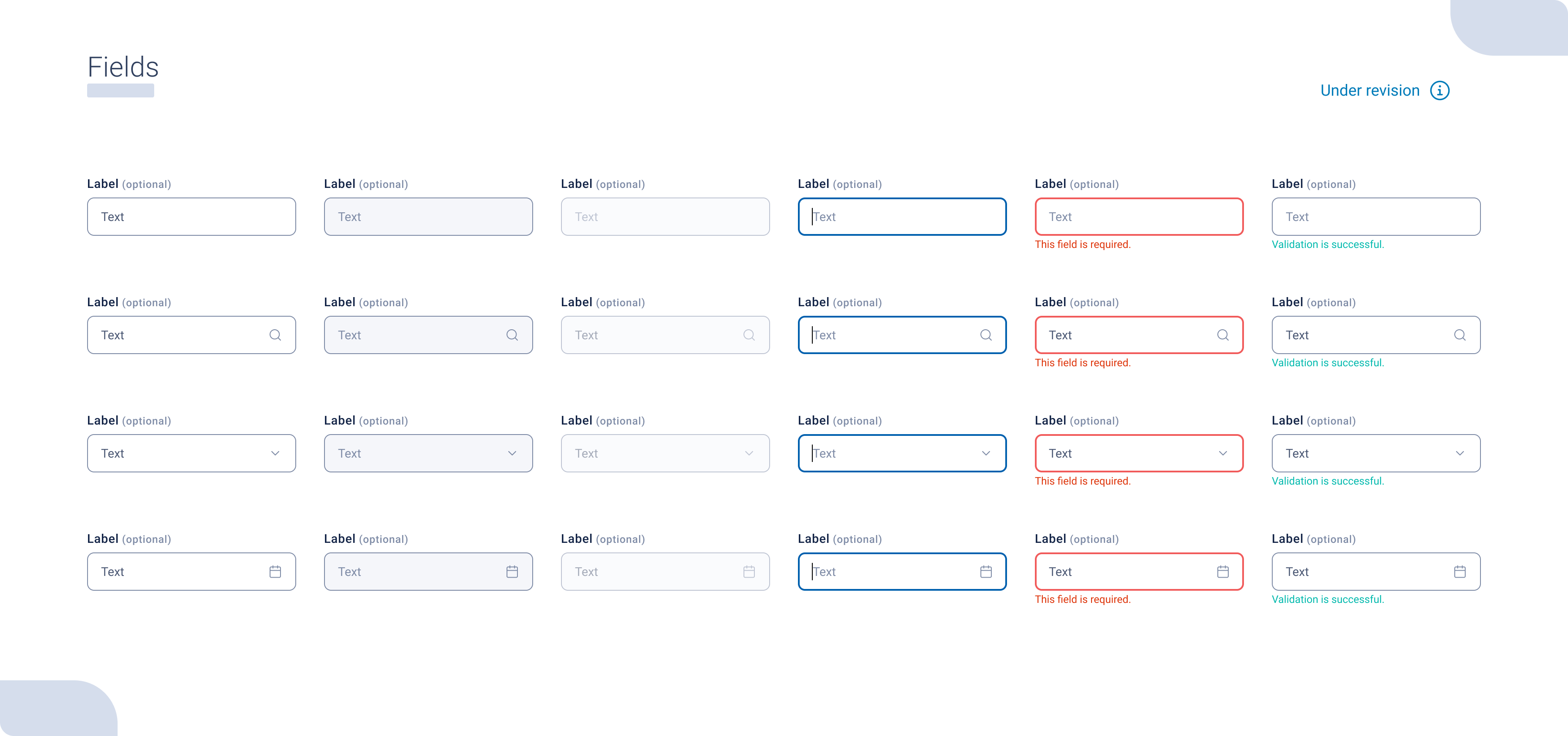
Taking inspiration from the Atomic Design methodology, I organized the basic components by complexity so the team could find them quickly. Atoms like tags and buttons form the base of our system. These simple components include every possible scenario and state, acting as a living resource for developers to see exactly how they need to implement user interactions.
Complex Assemblies
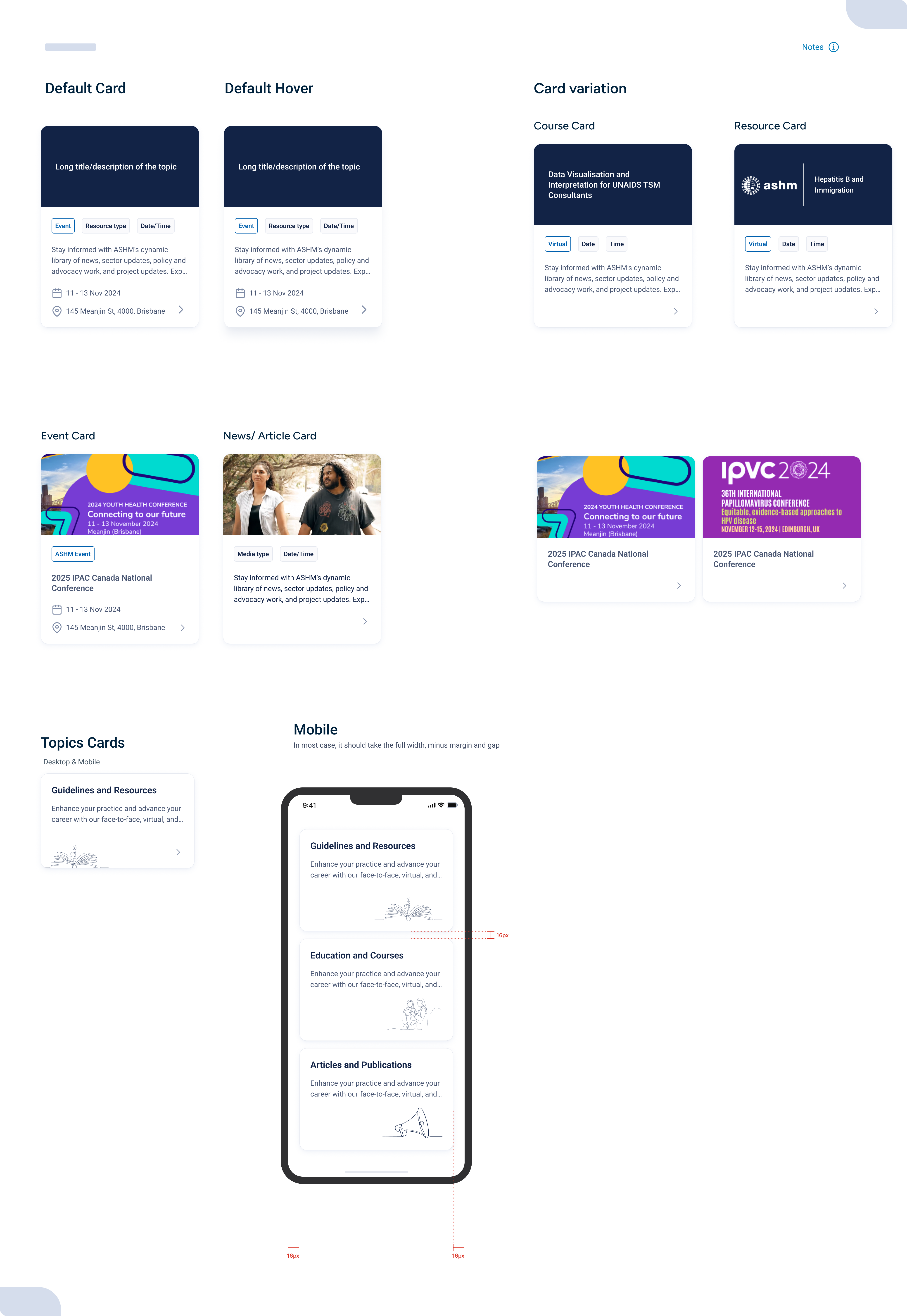
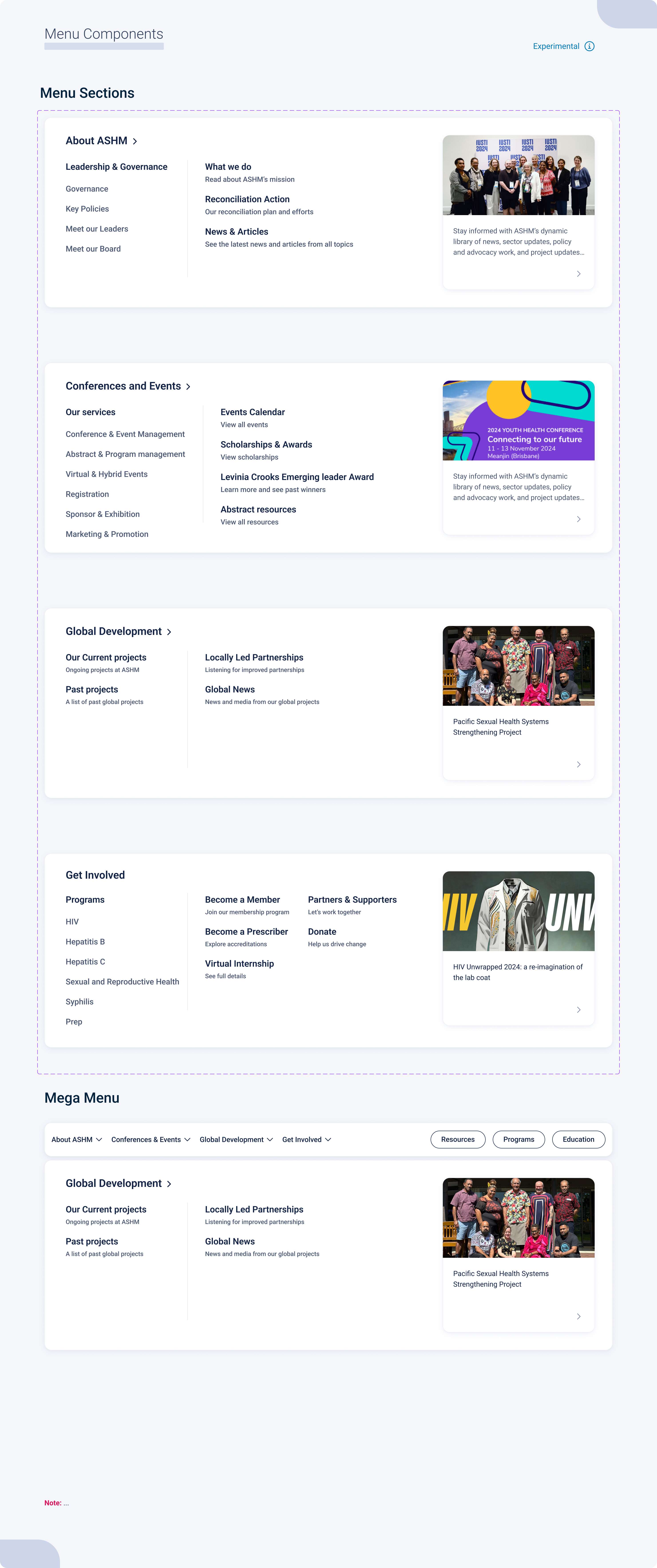
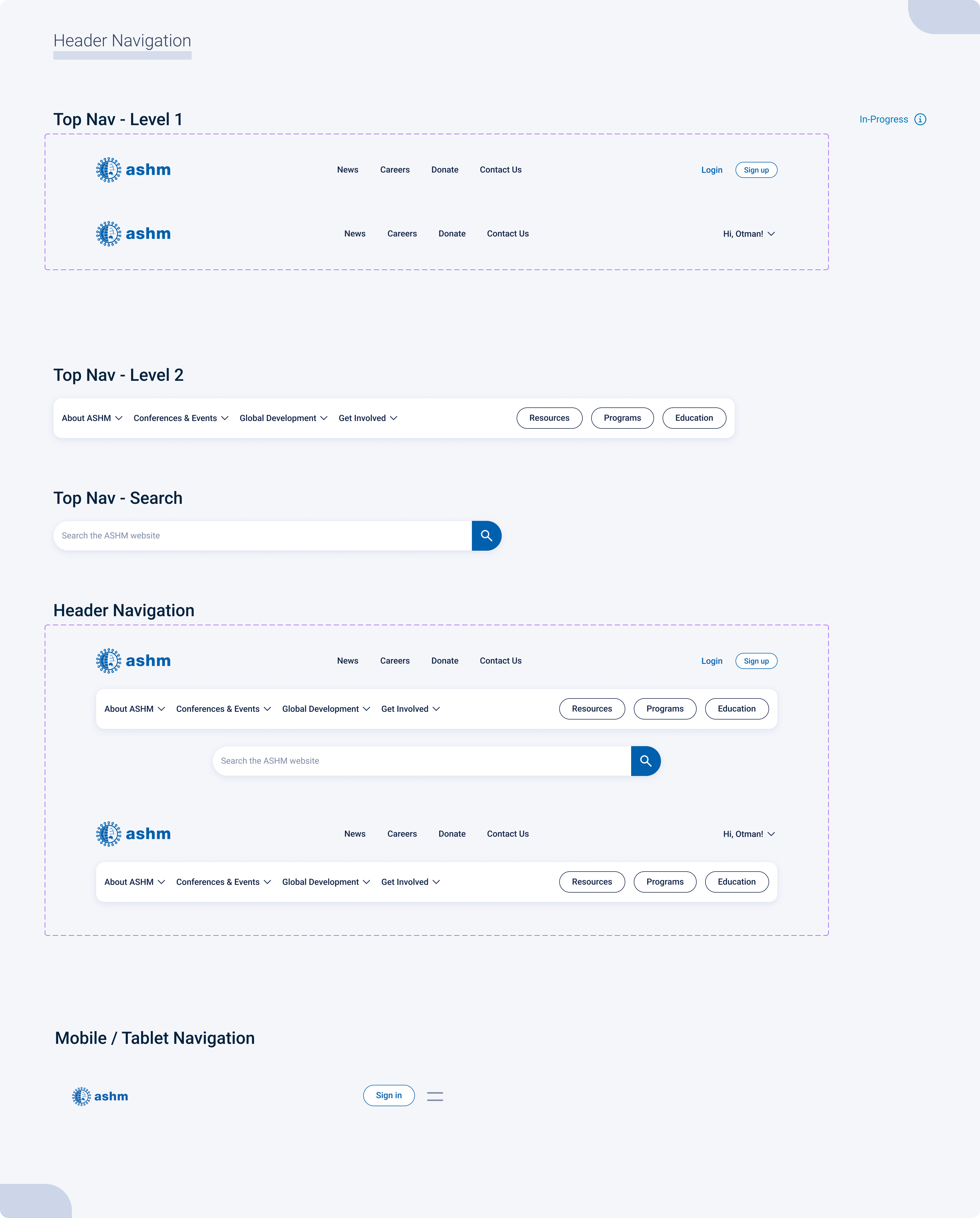
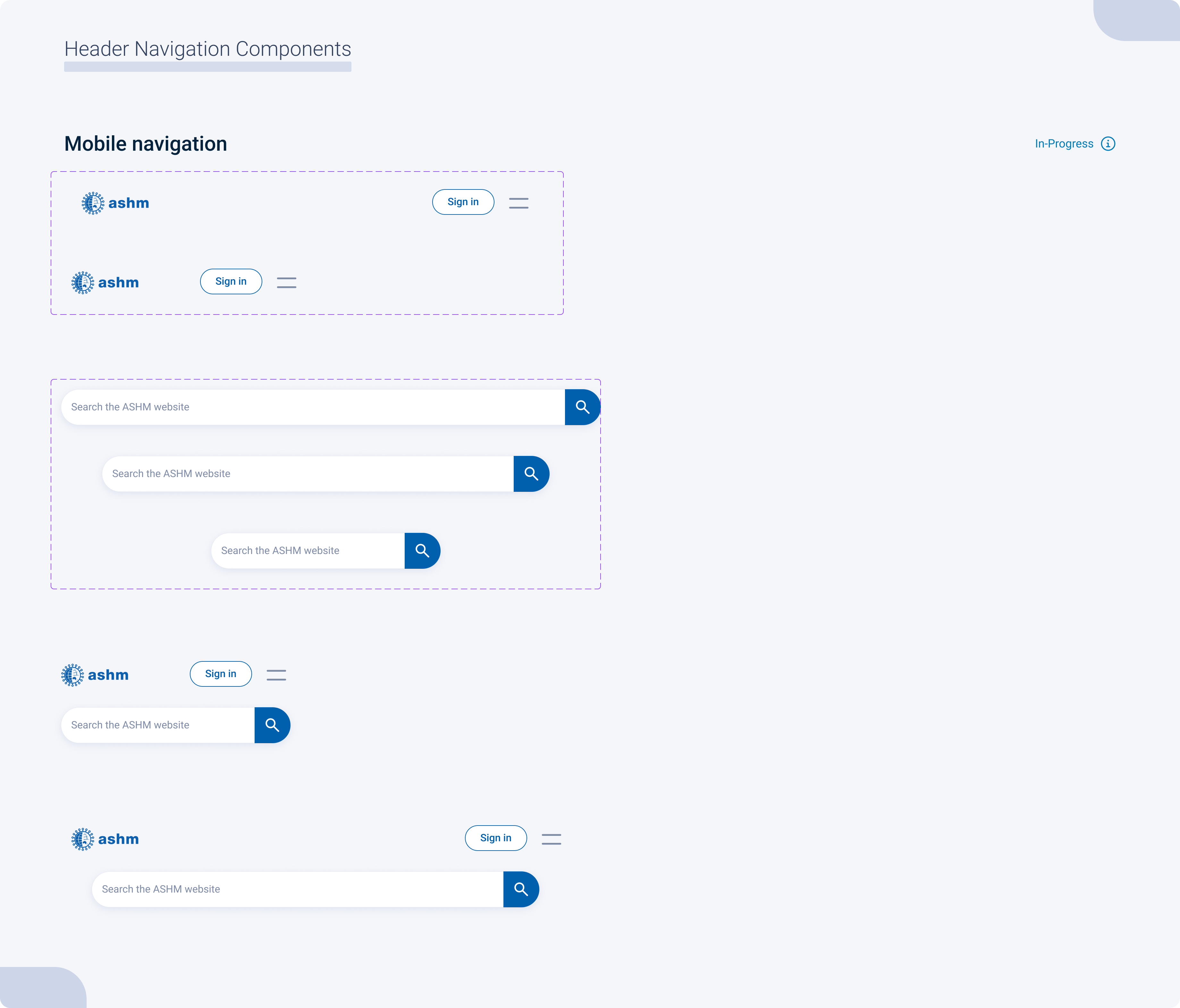
Organisms are the most complex components. They combine the smaller atoms and molecules to create robust blocks like content cards and navigation menus. These macro components act as the primary building blocks for all of our platforms, ensuring a cohesive user experience regardless of the specific brand styling.