Australian STI Management Guidelines
Improving clinical access to public health protocols through structured Information Architecture.
Project Impact & Scope
The Discovery Phase
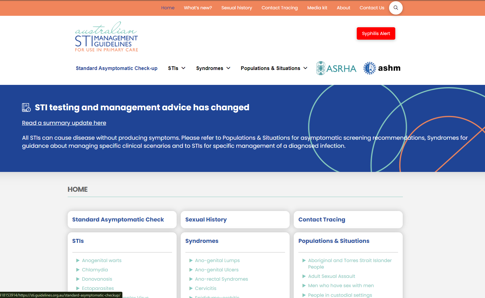
The Australian STI Management Guidelines is a critical resource used by primary care health professionals across the country. However, before writing a single line of code or drawing a wireframe, I conducted thorough usability testing on the existing legacy website to understand the reality of how doctors and nurses were interacting with the platform.
The testing revealed significant pain points: healthcare workers were getting lost in fragmented navigation, taking far too long to find time-sensitive treatment protocols while a patient was sitting directly in front of them.
"I just can't find the correct dosage fast enough while they are in the room."
— GP, Regional Clinic
"Time is absolutely critical when the patient is sitting right in front of me."
"The navigation is so deep I keep getting lost."
— Sexual Health Nurse
Research, Alignment & Co-Design
This was an end-to-end project. I facilitated stakeholder meetings for feedback and collaboration, deployed a survey, and conducted in-depth user interviews to synthesize both qualitative and quantitative data. By co-designing the new redesign prototypes with the second half of the interview participants, we ensured that the new architecture matched the mental model of medical professionals perfectly.
The Methodology
- 1
Stakeholder Meetings: Presenting findings and collaborating on business and public health requirements.
- 2
Survey & Interviews: Gathering a quantitative baseline from a targeted survey, alongside qualitative pain points from interviews with active healthcare workers.
- 3
Co-Design Sessions: Validating the new information hierarchy by prototyping directly with the second half of our interview participants.
Streamlining Mobile Navigation
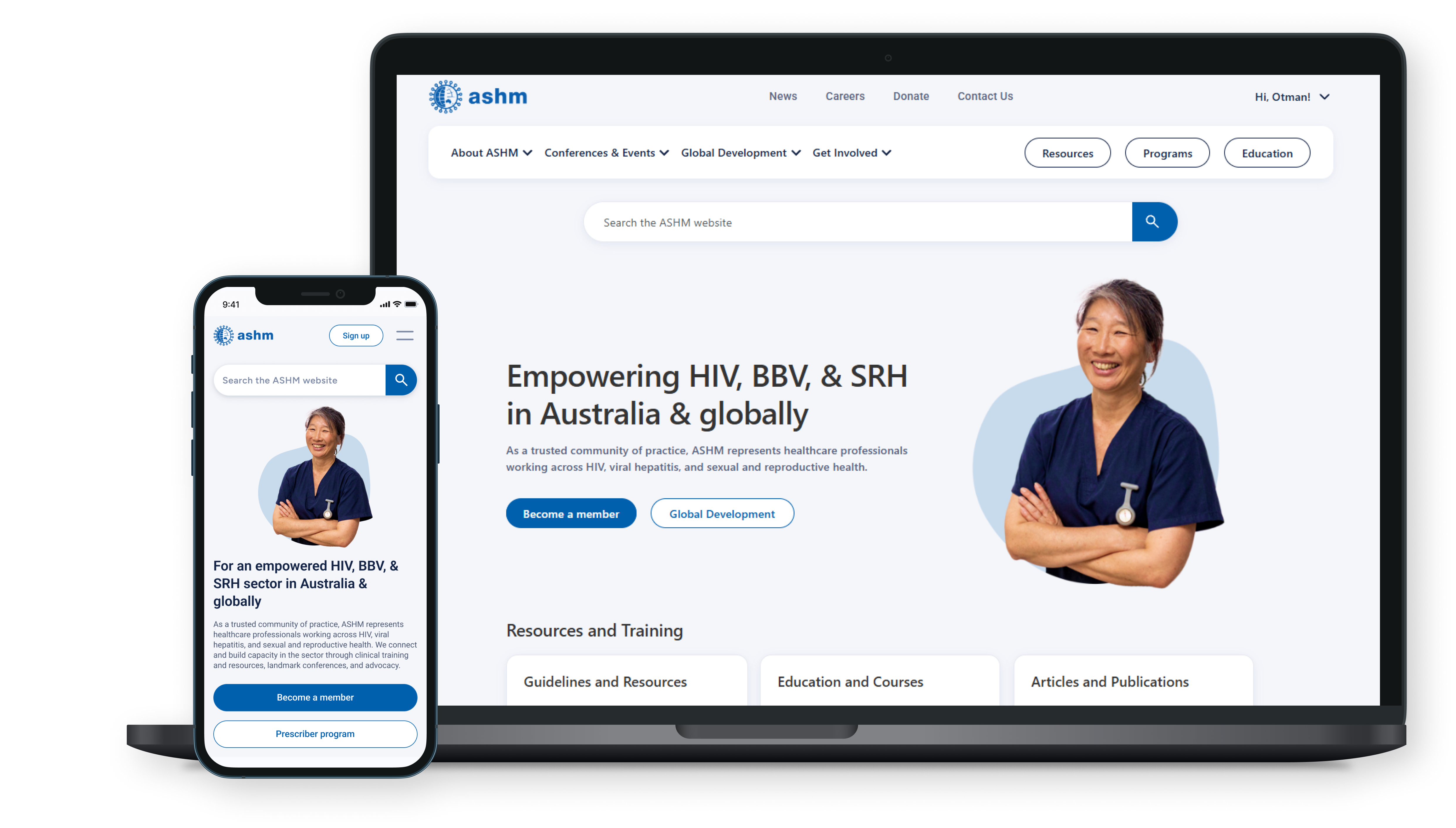
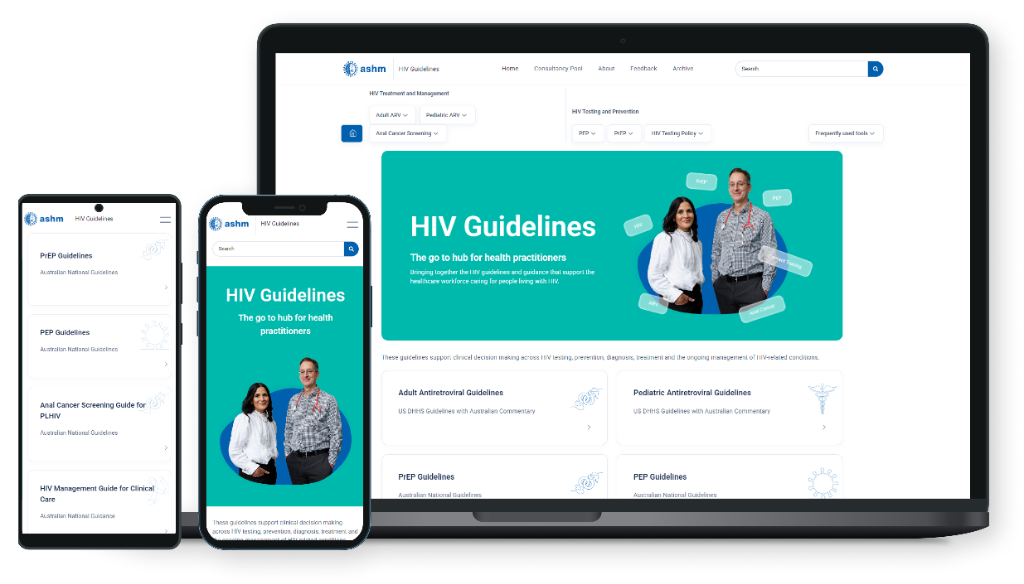
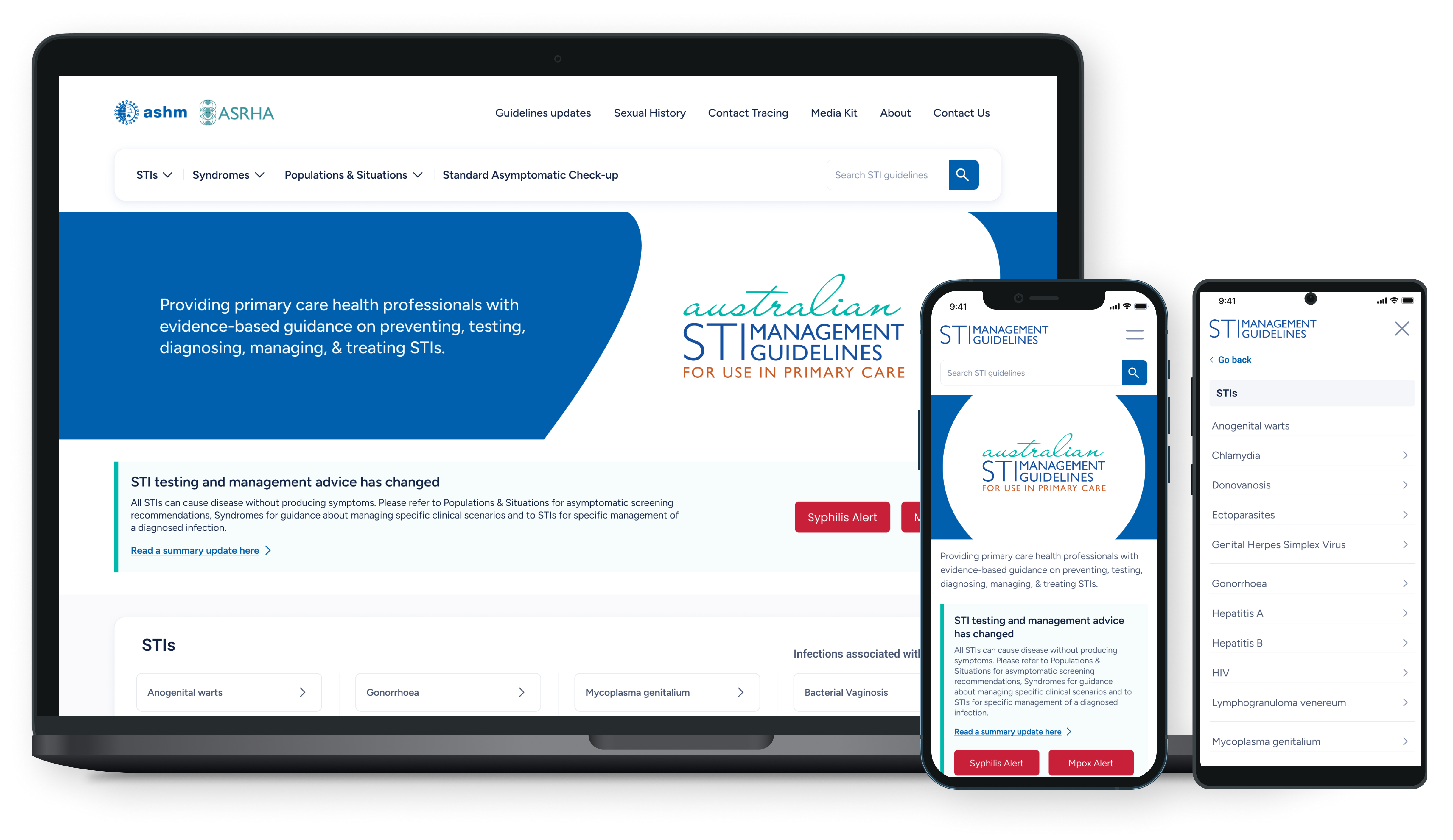
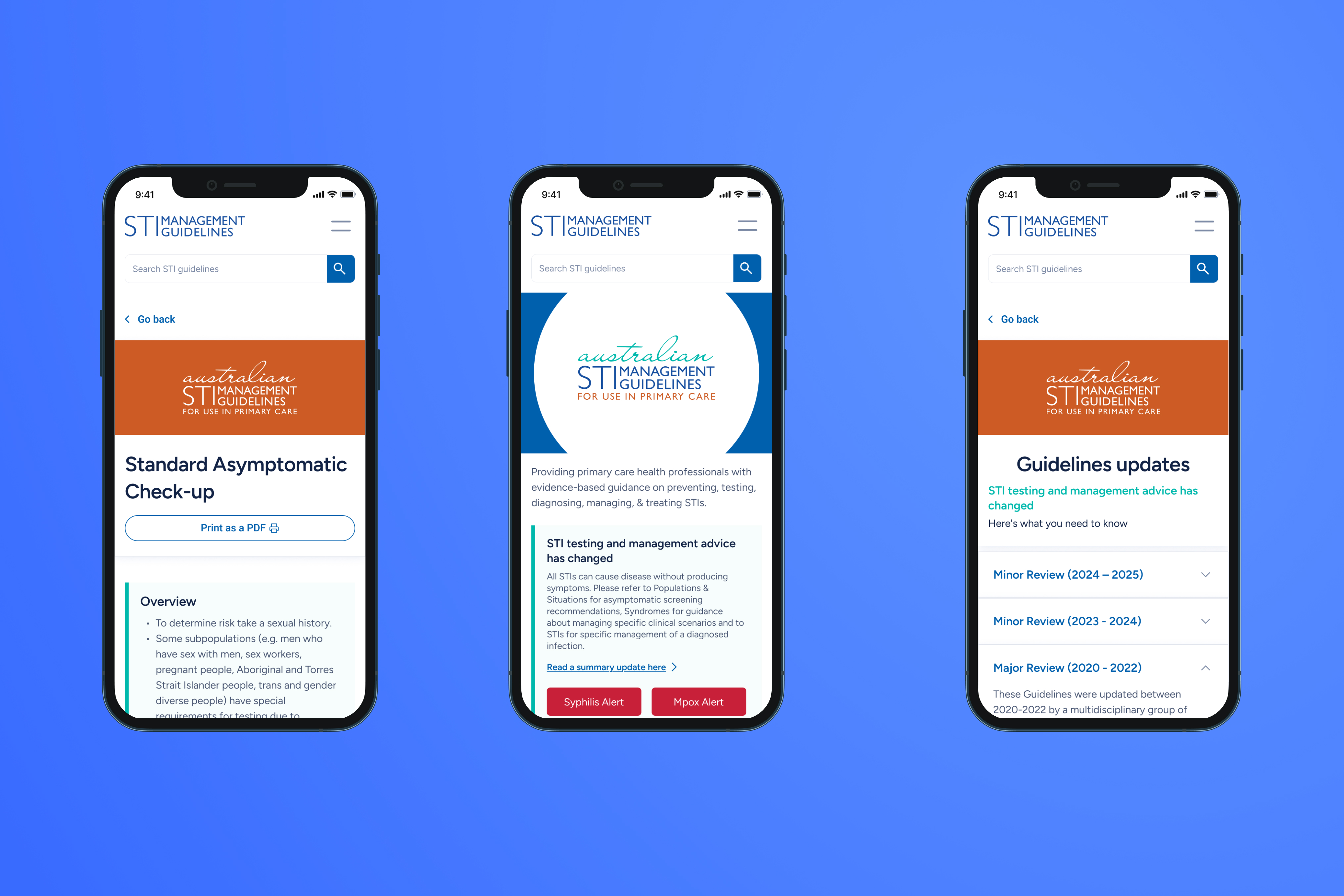
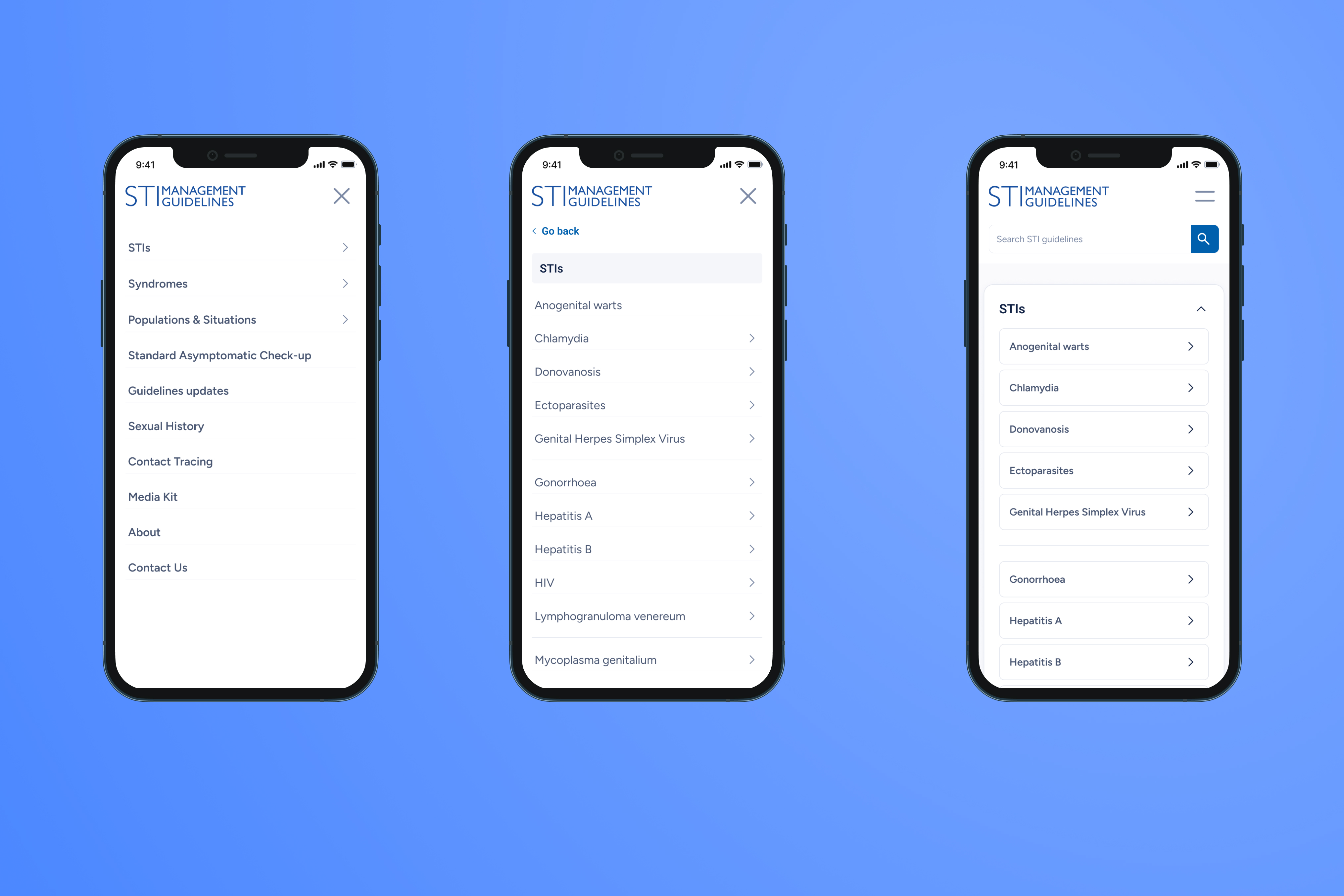
One of the loudest complaints from our interviews was that mobile navigation on the legacy site was not a pleasant experience. Clinicians accessing the guidelines via phones or tablets during rapid consultations found the old menus cramped, unresponsive, and overwhelming. These screens showcase the new mobile-first approach—a streamlined, accessible, and touch-friendly redesign that ensures critical clinical pathways are always within a thumb's reach.
The Solution
Restructuring the Information Architecture
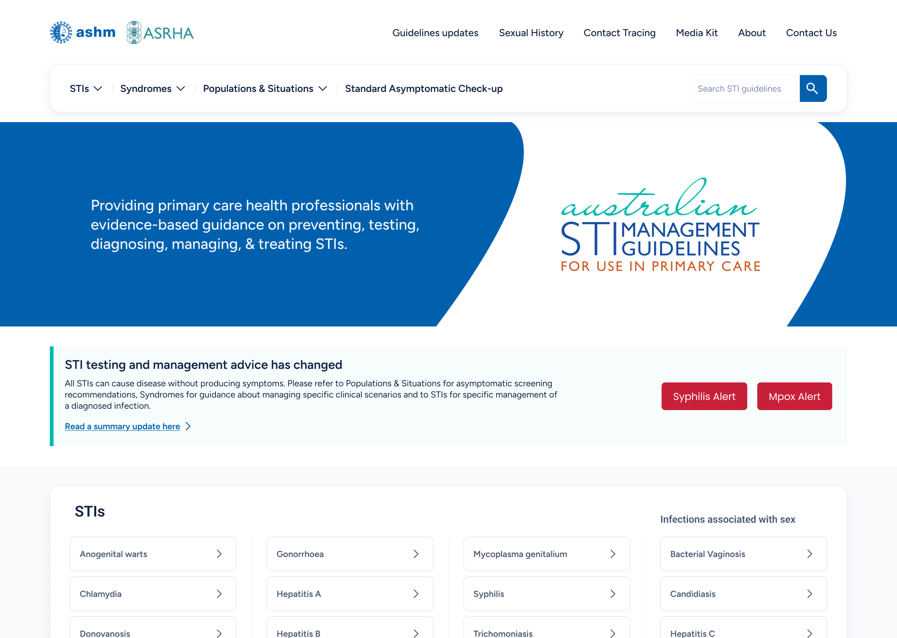
The core solution involved fundamentally restructuring the site's Information Architecture. We implemented a Mega Menu to categorize the extensive clinical data into a more predictable structure. We also introduced a significantly more robust, predictive search experience, drastically reducing the time it takes for healthcare professionals to find necessary protocols in high-pressure environments.
Accessibility & Usability Focus
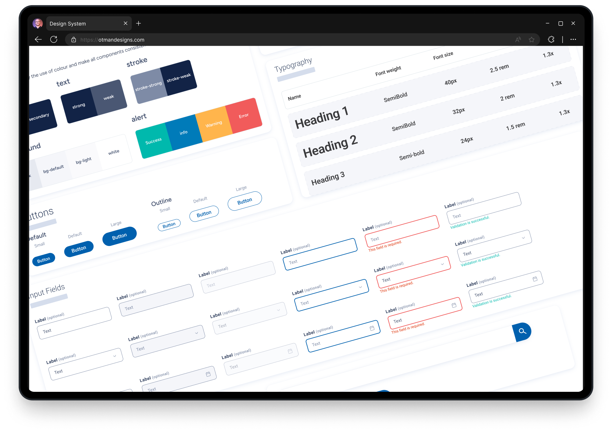
When designing the final prototypes, vastly improving accessibility standards across the board was a primary focus. The design system was overhauled to meet strict WCAG guidelines, ensuring high contrast, legible typography, and touch-friendly targets. We also introduced clear, dynamic public health alerts to surface critical information without overwhelming the user on mobile clinic devices.
Impact & Takeaways
By anchoring the redesign in rigorous user testing and continuous co-design, the final prototypes successfully untangled a massive web of clinical data. The resulting design provided a much more predictable, calm, and accessible experience for healthcare workers who rely on these guidelines in critical moments.